 |
| Windows 8 Release Preview Unleashes the Power of Metro |
Surprise! Microsoft just released the Windows 8
Release Preview (RP) — the next big step in its seemingly never-ending
journey to get on store shelves — bringing new features, improved apps
and more polish to the whole experience.
Except it’s totally not a surprise. Ever since a leak of the new version appeared on a Chinese website, unnamed “sources” have come forward to spill the beans that the RP was coming today, and Microsoft itself even reportedly let the cat out of the bag early with a blog post, which it quickly took down. Oops.
Microsoft was also kind enough to once again give Mashable an
advance look at the many additions and improvements to Windows 8 and its
innovative Metro user interface (download for yourself here). Almost all the changes are welcome, though some of the issues we had with the Consumer Preview still haven’t been addressed — although that may just come down to differing philosophies with how the UI should work.
A lightning recap: Microsoft is re-inventing Windows. Windows 8
radically alters the experience with a highly visual interface called Metro.
Metro is loaded with rectangular iconography that maintains a
consistent look and experience across apps — and it also happens to be
ideal for touchscreens, like tablets.
If such massive change sounds scary, you can take heart that the
familiar desktop environment is always a click away from Metro.
Microsoft is rolling out Windows 8 in stages: The first was last fall’s
Developer Preview, then the Consumer Preview in February, and now it’s
time for the Release Preview. This will be followed by the full-on “here
it is, folks” General Release, expected this fall (no formal date has
been announced).
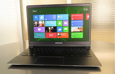
We got to try out the Windows 8 Release Preview on an Ultrabook — the Samsung Series 9,
a gorgeously thin and light device, powered by an Intel Core i5
processor (merely second generation, sadly). The laptop environment is
likely going to be the main place customers first encounter Windows 8,
so it’s a great way to test how this thing is going to work in the “real
world.”
Gearing Up
First impressions weren’t so great, since the machine’s touchpad was
incapable of clicking on the “Accept” button on the terms of service
page that first appears when you switch on the machine. After futzing
with keyboard commands for a while, I was able to get past it, and the
touchpad had no more problems. Hopefully it was just a bug with our
machine.
The touchpad may have been a little buggy because that’s one area
that’s much improved. Microsoft has added some new touchpad gestures to
Windows 8. You’ll actually have to download the drivers for them
separately from the RP download, but they include very useful tools like
being able to call up the “charms” menu by sliding in from the right
edge — exactly how it works on a tablet. I criticized the Consumer
Preview for the keyboard-and-mouse interface not quite working the same
way as the touch experience, and this mitigates the problem a little.
The special drivers also add the ever-popular ability to perform
two-finger scrolling. The feature is extremely useful, proving popular
on MacBooks and many Windows 7 machines. However, the implementation is
incomprehensible.
Here’s why: Metro’s entire design aesthetic is based on scrolling
horizontally. Why, then, when I scroll up and down, does the screen
scroll left to right? This is an insane choice. It puts the experience
at odds with the vertically scrolling pages you’ll encounter in Internet
Explorer, and it’s totally inconsistent from app to app: To scroll
horizontally, you sometimes gesture up/down (People, Photos),
side-to-side (the Start screen) or both (Finance).
If there’s a setting that can restore order to this chaos, I didn’t
find it. Microsoft really should sort this out before General Release — I
can see it being a real turn-off for casual users.
Doing It Live
Live tiles — those constantly changing rectangles on the Start screen
— are one of the big improvements in RP. In the Consumer Preview, a
scant few were really dynamic; now the majority are, and your Start
screen is an ever-morphing array of photos, headlines and notifications.
It may sound chaotic, but bringing order to things like this is where
Metro excels.
As great as live tiles are, they could be better. Some of the new
apps, such as News, Sports and Travel, don’t vary the live-tile content
that much — you tend to see the same photos over and over.
Also, when a headline or photo catches your eye, there’s an
expectation that when you click on it, you’ll see that content. However,
clicking on a live tile will take you back to the app’s last state,
regardless of what was showing on the tile. I understand the dilemma
about which is more useful, though, so maybe there’s no good solution
here.
Did I mention there were new apps? Microsoft used its beautiful
Finance app as a template for its News, Sports and Travel apps. They all
make great use of the horizontal scroll, and they have nice
customizable features, like seeing feeds on specific teams or search
terms for news topics.
They could use a little more polish, though. For example, once you
set up a few topics to follow in News, there’s no easy way to rearrange
them. And consistent refresh buttons would be nice, too.
Appapalooza
Many of the other primary apps have gotten a makeover as well. People
(the contacts app) is most improved, with the “What’s new” feed, which
shows social-network updates from your contacts, now approaching
something useful. It would be even better if it incorporated images (a
la Flipboard), but it’s a step in the right direction.
I finally got Flickr to connect with the Metro Photos app, although
the pulling-teeth process to do so betrayed an issue: there’s no easy
way to simply sign out of Flickr and reconnect. When you try (via the
“Options” link), you get kicked into Internet Explorer to a very
cluttered and confusing permissions screen. This should be handled
within the app, and in a much simpler fashion.
Mail has a bit more polish, rendering HTML emails nicely.
Unfortunately the RP only has presets for adding Windows Live and Google
accounts — everything else is done through Microsoft Exchange. Lots of
people still use Yahoo and AOL (sadly), and those should be added before
general release. Also, there’s no combined-inbox view, oddly.
Music has a few more tricks, now able to access content from your
Zune Pass (like that wasn’t going to happen) as well as a controller for
the lock and start screen: Now when your screen times out, you’ll be
able to adjust volume and skip tracks without logging in.
Xbox 360
owners will no doubt love the Xbox Companion, which is more than an app —
it’s a way to stream media and control your console from your PC.
Whenever you play a Video or Music file, you’ll be able to stream it
right to your Xbox. You can even choose to download the title straight to
the Xbox, without the need to stream. Best of all: It automatically
sets itself up, as long as your PC and Xbox are on the same Wi-Fi
network.
Internet Explorer Upgrade
Finally, there’s Internet Explorer 10,
Microsoft’s in-house web browser, which adds a couple of interesting
features. First, Microsoft has added a strip of frequently visited and
pinned/bookmarked sites that appear when you begin typing in a URL.
Potentially more useful, however, is “Flip Ahead,” which adds an
arrow (only visible if your mouse is close by) to the right of the
screen. The arrow looks at Bing user activity and page data and actually
tries to predict the most likely page you want to go to.
This would be very handy for, say, articles split among multiple
pages — that is, if it actually took you to the next page. In my brief
test with a few multi-page articles from Slate, it did nothing of the kind, but perhaps it just needs tweaking (and more user data).
Most important, IE10 now has Flash compatibility built in. However,
as Microsoft explained to me, this does not mean that every Flash site
will render properly. Since IE in Metro uses a customized version of
Flash that Microsoft worked directly with Adobe to create, sites need to
submit themselves for approval to work with IE10. Microsoft said it’s
already taken care of big Flash sites (like YouTube) and more are
getting added to the bucket.
Windows 8: Almost Fully Formed
With the Release Preview, Windows 8 enters its final stretch toward
release, ready or not. There’s clearly lots of polish here, and
Microsoft has good reason to be proud. One great example: In addition to
the many features I’ve outlined here, the RP adds the ability for Wi-Fi
passwords to travel with your Windows Live ID. That means if you ever
borrow your friend’s Windows tablet or switch machines, you won’t have
to input the network passwords for your home router, local coffee shop,
etc. It’s a nice convenience that I hope is stolen by Android and iOS
quickly.
Nonetheless, I’m still bothered by some of the basic interface issues
(like the inconsistent scrolling). Windows isn’t just the OS for work
machines — about 90% of the world’s computers run it. That means this
thing has to be idiot-proof, or users will hurry to exit Metro for the
traditional desktop.
That would be a shame, since there’s a lot to love in Metro; it just
needs a perfectionist’s touch. There’s still time. Windows 8 may be
close to the finish line, but whether or not it scores a win probably
depends more on what happens in the next few months than even Microsoft
thinks.
source : http://mashable.com
wijesoftware.[official]
-
17.18


0 komentar:
Posting Komentar
terimakasih atas komentarnya